Emergency Google Mobile Responsive Website Design Conversions
Joomla mobile friendly template design and mobile website conversions
Wordpress mobile friendly template design and mobile website conversions
Drupal mobile friendly template design and mobile website conversions
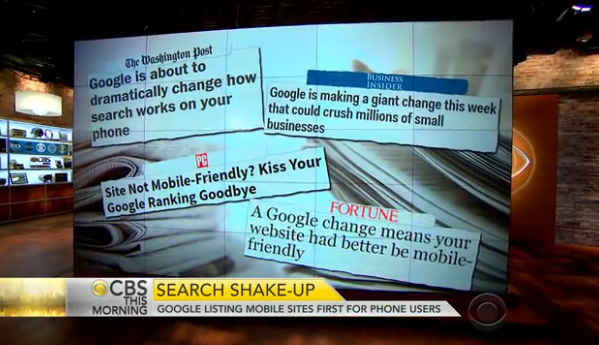
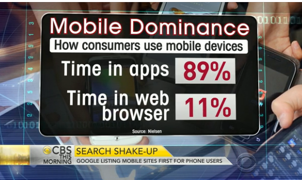
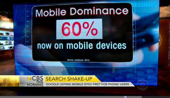
Its finally here, google search results changed today affecting at least 70% of all websites. If your website is not mobile friendly, your site will be penalized and will fall in the rankings on mobile devises. This only effects search results on mobile devises such as iphone, ipad, tablets, android etc. Did you know that over 60% of all search engine searches are done on a mobile devise. Not only that, but 89% of all mobile users spend more time on apps. If your website is mobile and you have a certified mobile app your website is more likely to return at the top of search results.
Watch this CBS news google mobile website video from 4/21/2015
Mobile Apps Dominate Mobile Usage and Ranking Results
911websiterpair specializes in mobile responsive website conversions and well as the development of mobile apps. We know this is an emergency for many sites that are losing their rankings on 4/21/2015. It takes time to make the mobile template conversions, so don't hesitate to contact one of our managers today. We can either recreate your current custom designed template using existing frameworks, or use a commercial template and adapt it for your websites look and feel. Its your choice, either way we can make your website mobile responsive. In some cases your website may need to be upgraded to new versions of your wordpress, joomla, magento, or drupal cms installation.
Its very easy to find out if your website is mobile responsive.
- Go to your mobile device and do a google search for your website. In order to be ranked you now need to have the Mobile-Friendly tag. If you do not have the mobile-friendly tag, your website is not mobile
- Go to the Google Mobile Friendly Tester and get a report
- On your computer, see the line, the box and the X icons at the top right of your browser. Click the box, and then drag the right hand edge of the browser to the left. It should snap the site into a mobile layout. If everything lines up nicely you may be ok. If your images and content and menus are not all in the frame, you are not mobile responsive.
- Google also penalizes for the use of third party programs that convert your website to mobile. They want one site with the template managing the mobile responsiveness. They are penalizing for redirects to these third party mobile sites as will as the redirect of content to specific mobile layouts within a website
- Create a google webmaster tools account and google has a section that will report on your websites mobile status.
What is Responsive Web Design? Wikipedia defines it as “an approach to web design aimed at crafting sites to provide an optimal viewing experience—easy reading and navigation with a minimum of resizing, panning, and scrolling—across a wide range of devices (from desktop computer monitors to mobile phones).” The main advantage of RWD is that it allows for one URL and single content source. An RWD website can serve any device or screen size, so you do not need to design separate websites for mobile, tablet, and desktop devices.
Google Mobile-Friendly Tips
- Eliminate misaligned technology: Make sure mobile users aren't presented with Flash content or other software that doesn't run ubiquitously (or at all) across mobile devices
- Don't force users to pinch & zoom: Size page dimensions and fonts to correlate with the user's form factor and viewport without scrolling or zooming
- Right-size content and images: Just because mobile browsers can resize images, you're still forcing the user to download more content and drain the device's battery and delaying engagement
- Tailor to touch: Ensure buttons, links and other CTAs are placed/spaced to allow users to tap correctly
Contact our managers and get a quote for the fastest possible mobile layout conversion for your site.
